A podcast App for everyday parenting education
with 220K users


Role
Head of Design 2017-2020. Ship the app from zero to one. Built a design team of four.
Deliverables
Mobile Product, Branding, Illustrations, Marketing assets.
approaches
Data-informed: used data as reference, combined with user insights to support product-led growth.
The idea behind HelloJoey
Parents search for online resources for specific parenting issues (e.g. picky-eating). Many of the resources fail to address the fundamental root cause, such that the parents are not able to learn the principles and apply them to everyday parenting.
“How might we offer a convenient way for the parents to get into parenting science in a busy day-to-day life?”
-Problem Statement
Problem Study
The first concept mockup version was a digitized transcription with audio and text from an offline Parenting science class - Patty Wipfler’s Hand-in-Hand. This is used as a starting reference point, 50 parents are recruited to provide their feedback.
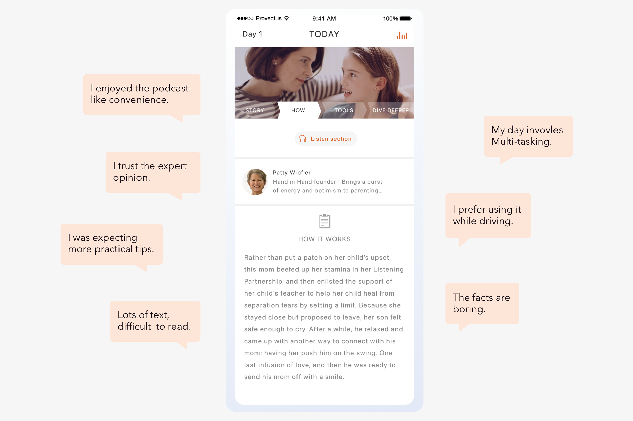
“As a busy working mom, I am too busy to learn because my time is fragmented, I need simple parenting.”
- Claire, a mom of two


Key Insights
First:
Parents don’t know what they don’t know.
Second:
Parents are on a busy schedule.
Third:
The steep learning curve.
Holistic Design Strategy
Overall Solution:
Design a mobile podcast product that enables learning at any time on the go.
Design Goals:
Flexibility; Simplicity; Trust; Joyfulness.
Key UX Differentiator From Other Products:
A content delivery-based parenting learning experience instead of a searching-based parenting exploration experience.
solution overview


Monetization through Data-informed design
Part One: Pre-Monetization
Part Two: Customized Subscription Flow
Part Three: Refinement with AB Testings
Part One: Pre-Monetization
Even though we have sizable user registrations, we discovered that the user retention was low (7-day DAU < 10%). This would be disastrous for monetization through in-app purchase subscriptions. A natural thought was to use push notifications to increase the app's open rate. It worked and encouraged business stakeholders to invest in more notification designs.

Here the retention fall-off is the single data point we observed, I believe it’s driven by something more profound. Push notifications might be able to give the metrics a temporary boost.
However, to drive the real product-led growth, we need to have a holistic end-to-end story of our product so we don’t go sidetracked into single data points. We are informed by the data insights instead of purely driven by the data.
To dig to the root,
I worked with the data engineer and PM to expand the retention analysis range from landing pages to content learning flow. With a broad view, we discovered from registration to the end of content completion, 33.2% of users started the kit learning after registration; Only 15.46% of users completed the learning content we suggested. That means the learning experience need to be improved.
“HMW motivate user by more engaging learning experiences?”
- Problem Hypothesis
Solution Experiment One: Gamify Learning

Seek the truth
Initially, we designed to deliver podcast episodes twice a week at a fixed schedule to resolve the user’s pain points of a busy schedule. However, users lost the flexibility in controlling their pace, which was observed from the user survey. We updated the learning interaction to a new self-paced gamified format. Key insights:
Users cannot switch to another kit even if the current content isn't interesting to them.
Take-home exercise is crucial, users are willing to pay and use it frequently.
New User Experience
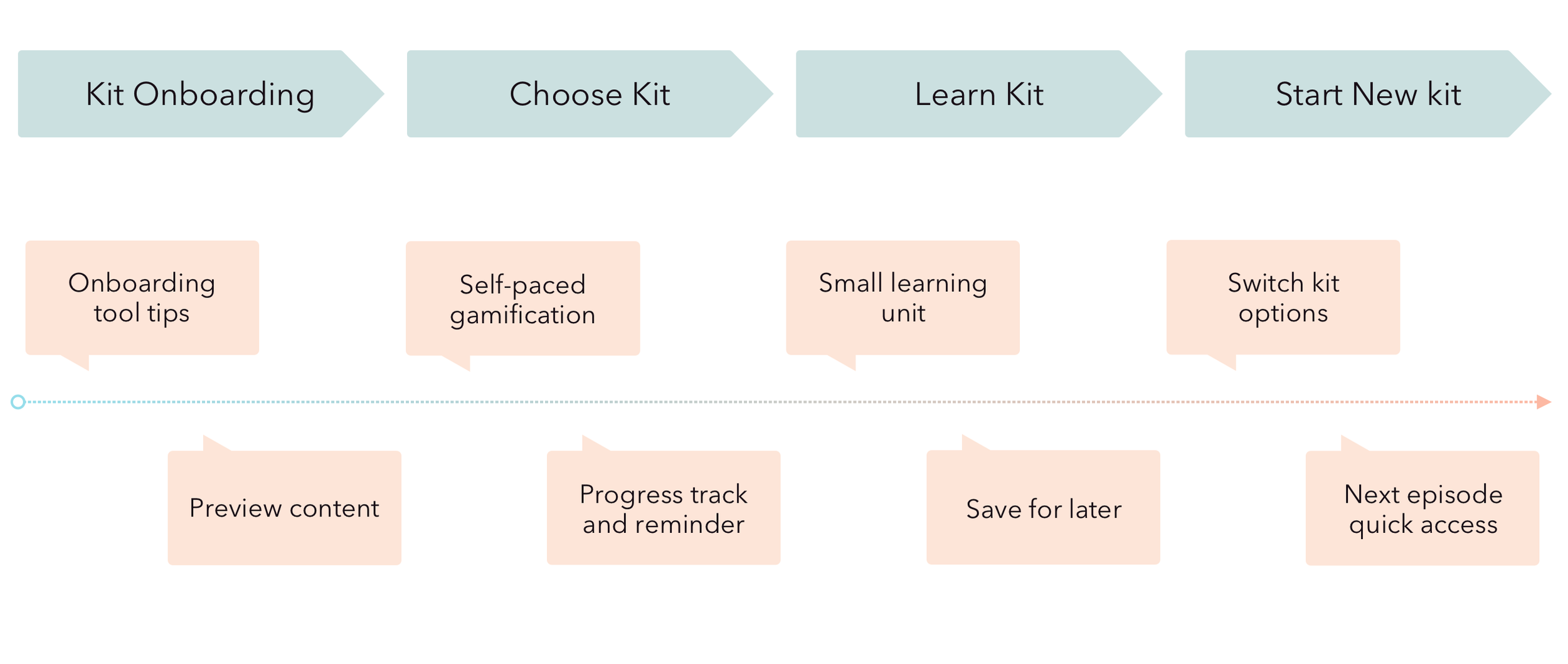
To improve UX in a holistic way, I divided the user’s “learning journey” into four experience phases. And I improved the user experience of each touch point.
Kit Onboarding
Choose kit
Learn kit
Start new kit
Design principles
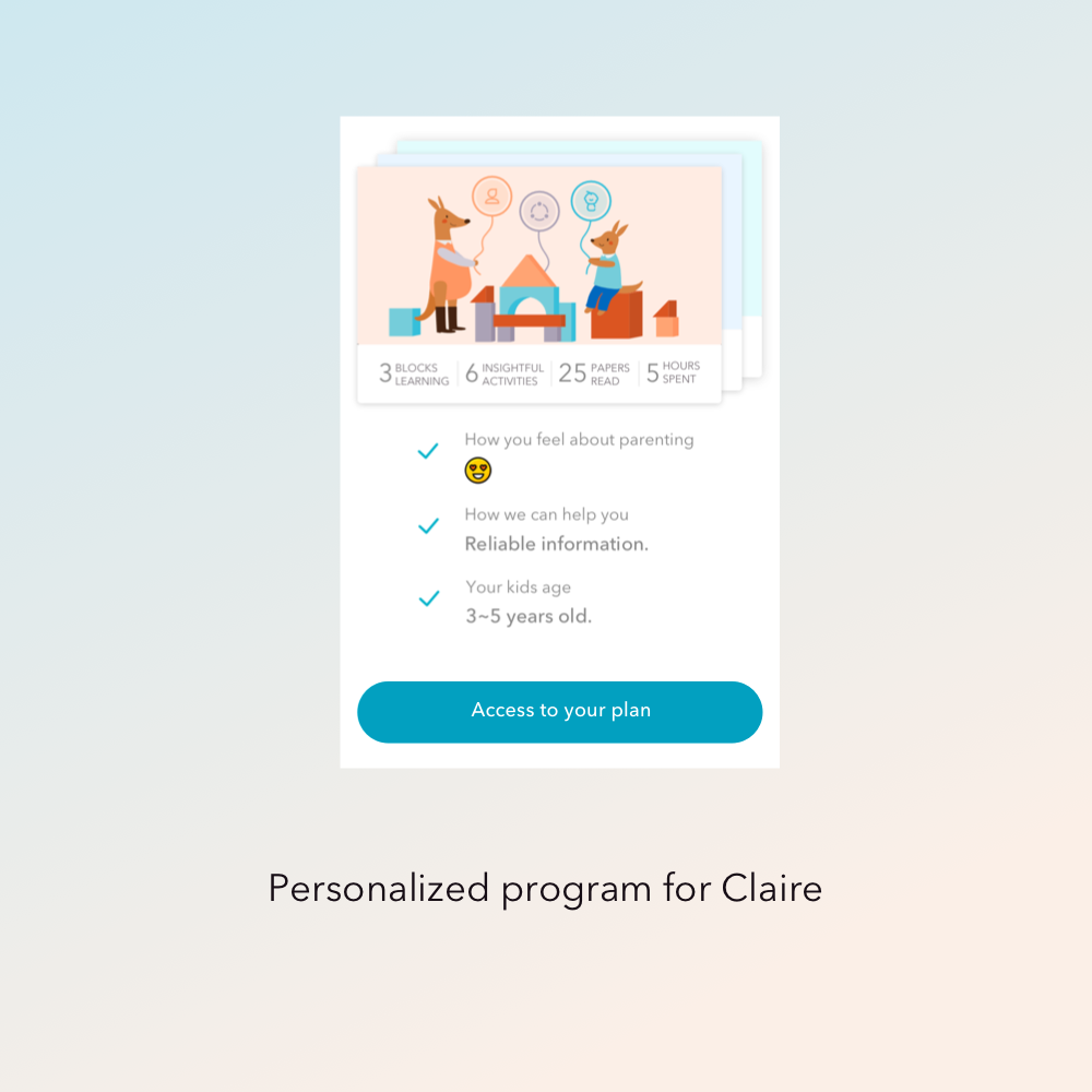
Personalize it:
In the new gamified experience, users are allowed to select a specific study kit and control their own pace.
interest matching:
Regrouped the landing page content to a flat information structure that benefits the user to preview all learning content to boost interest matching.
Flexibility:
Added a “save activities for later” tab (Build) to benefit those who can’t complete content in the same app exploration session. Especially from data, we observed a learning peak at weekend, which inspired us to create a place that accommodates users’ schedules.
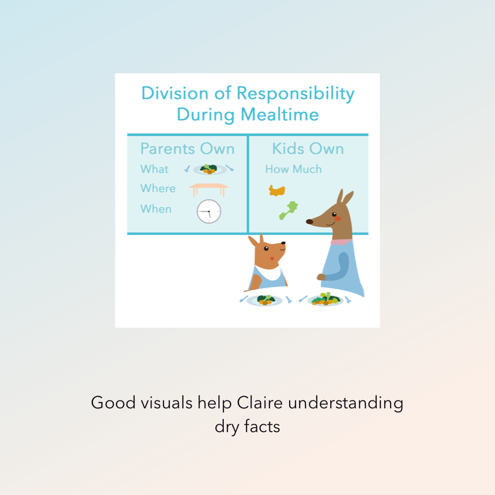
Make learning manageable:
The content was divided into smaller units - episode + activity + bonus, to reduce the mental workload.
Never stops:
Each time user completed a kit, provided shortcuts and recommendations to the next one.
After launching this design, the kit start rate was improved by 2X, the kit completion rate was improved by 3.5X, and user retention was improved by 3X.
Solution Experiment Two: Inner Motivation
The first attempt “Self-evaluation Pulse Check” was unsuccessful: Users did not see near-term incentives. Next, we designed a more near-term assessment called Trivia: Pre-learning knowledge test.
Results showed the pre-test users also had a higher kit completion rate.


Part Two: Customized Subscription Flow
Users came from different marketing channels, we designed three customized payment flows based on the segmentation, which resulted in an increased conversion rate.
Beyond data reference, we take advantage of cross-functional insights, we refined the persona with three segments based on marketing channels.
Potential Subscriber Segment A:
Drawn by Problem - they have specific parenting issues to address in mind.
potential Subscriber Segment b:
Drawn by Brand - The users have no specific issues and have a good idea of what HelloJoey is for.
Potential Subscriber Segment c:
ccc
Segment A Users are willing to pay for a tailored solution for their parenting issues.
- Solution Hypothesis for Segment A
Solution One:
Design a questionnaire-based onboarding that lets users feel our content is relevant to their concerns.
Solution Two:
The first kit free - Provide a chance to try the solution.
Results showed,
Questionnaire-based onboarding converted 95.5% of users from the onboarding step to the content learning step. The subscription conversion rate of 12.88% was above the market average.
Part Three: Refinement with AB Testings
When and how do we use AB testing? In this case, the conversion rate was one part of the monetization success metrics. The ultimate goal is to achieve the best ROI (Return of investment per user acquisition).
We collaborated with developers on a series of AB testings on pricing, buttons, and UI widgets.
We started with a small percentage of users, then rolled out the winning version to everyone. Floating button has a higher “payment start to success rate” (33.3% vs.25.5%) But has a lower conversion from “view plan to payment start” ( 36% vs.50%). The side-by-side payment plan layout has a higher conversion.
Brand & uI System
Branding is part of the solution:
Playful, engaging UI reduces the learning anxiety and balances the pressure of authority.
The Kangaroo logo:
Parenting is about relationships: two bonded characters represent parent and kid - “Grow Together”
UI System is easy to scale:
Consistent brand across all product channels. Well-defined UI system saves Implementing time.


Illustrations
HelloJoey’s content consists of a series of kits, each kit has a number of episodes. I created a series of illustrations to make the learning easier to digest. The illustration are well received by users.


Scaling the team
Despite having many surfaces to support, HelloJoey had me as the only designer for the first one and half years. We needed more resources to support the product growth; I recruited and built a design team of four.
Resource Planning and Collaboration: Besides hands-on designs, I was in charge of the holistic design strategies, digesting data insights, leading the use case brainstormings, creating solution mockups, and cross-functional alignment. To deliver consistency, each of us took part in the workflow. The other designers were responsible for marketing widgets, illustrations and some of the UI. I worked with them to set design goals, and define the design success criteria. We’re mainly using InVision + Sketch + Trello. I review and sign off each project.


