
Care.com is the world's largest online platform connecting families and care providers. It has 9.7 million members across 16 countries. As the first UX background designer at care.com, my main contribution was improving the provider side’s user experience by introducing user-centered design approaches to the design team. I helped establish the first UX lab to fulfill the product development gap.
Power Provider
Role
Product Designer.
Responsibilities
Research, Heuristic evaluation, User testing, UX & Visual design. Delivered end-to-end mobile solutions, with multiple releases in 2017.
Results Impact
Increased 30% marketplace interactions.
Business Problem
After we launched a new subscription-based transactional model, the seeker’s low subscribe conversion rate became the business bottleneck.
When the PM and I zoomed into the low seeker conversion rate, we found it might be related to the provider’s low credibility,
Provider interaction in the marketplace was low.
Service provider (sitters) profile completeness was low.
A low number of job applications per sitter
Long Response time (94% >24 hours).
A small number of provider with reviews


“How might we help increase the seeker subscription conversion rate by improving the provider's credibility?
- Problem Hypothesis-
User Study
I conducted an on-site user interview with 12 care providers (babysitters). The user feedback caught my attention that some improvements in the provider experience are needed. I put myself in the provider’s shoes, walked through the Care provider’s app flow, and validated the UX flaws that we learned from the user study.
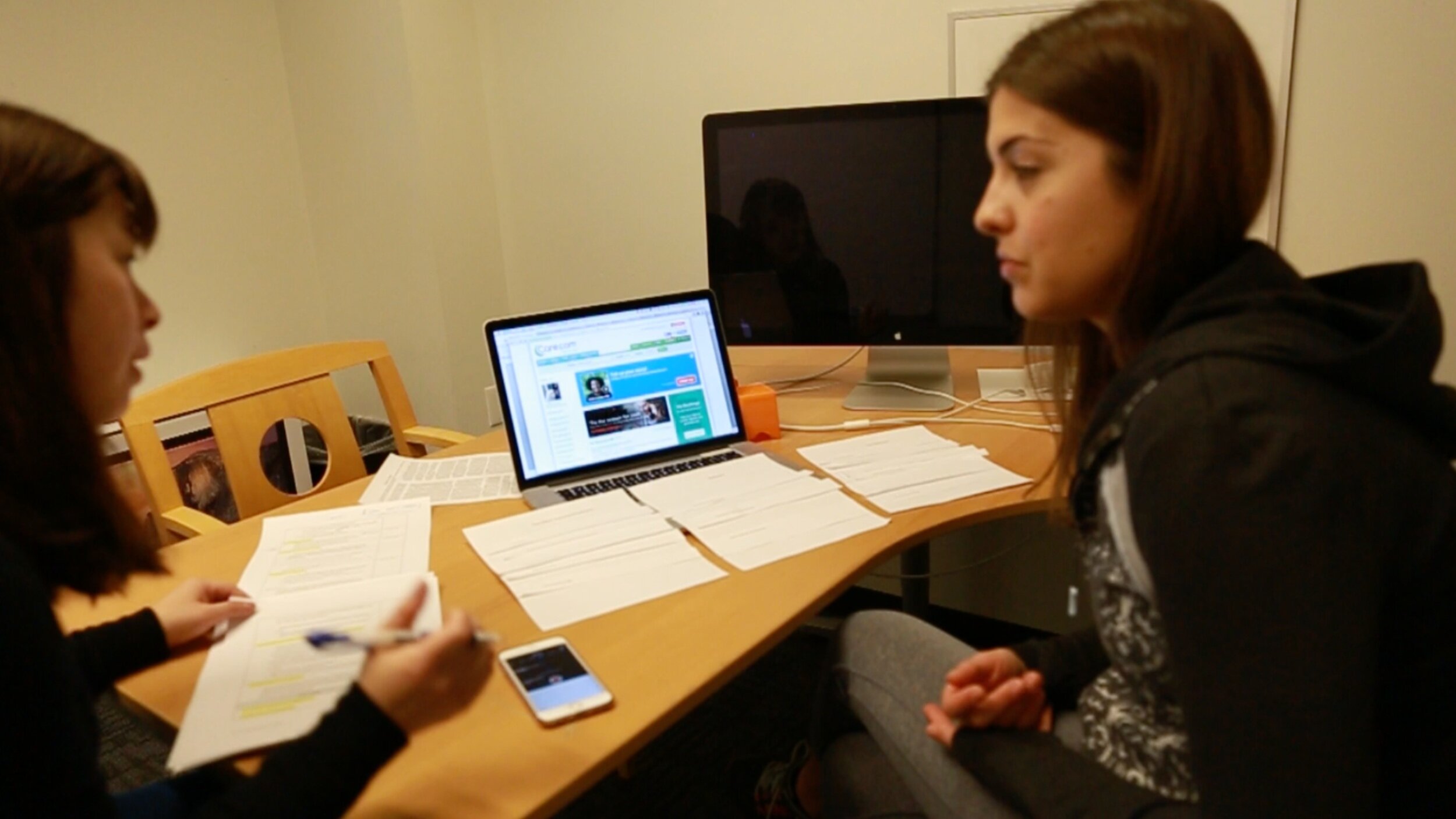
On-Site User Interview | Participant: babysitter| | Redwood City Office
On-Site User activities | Participant: babysitter| | Redwood City Office


Findings
“Why a provider doesn’t want to improve their credibility”?
"I am a busy college student. I don't see any point in updating my profile. I'm not sure if it's worth spending time on."
-Pamela
"I'm willing to but don't know how to improve the profile and reviews."
- Kris
"I didn't know my response time was long. Where do I track it?"
- Anna
Pain points from Provider:
Low trust in the product
Lack of motivation to engage
Lack of notification & guides leads to a long response time from providers.
Willing to but don't know how to improve the profile and reviews.
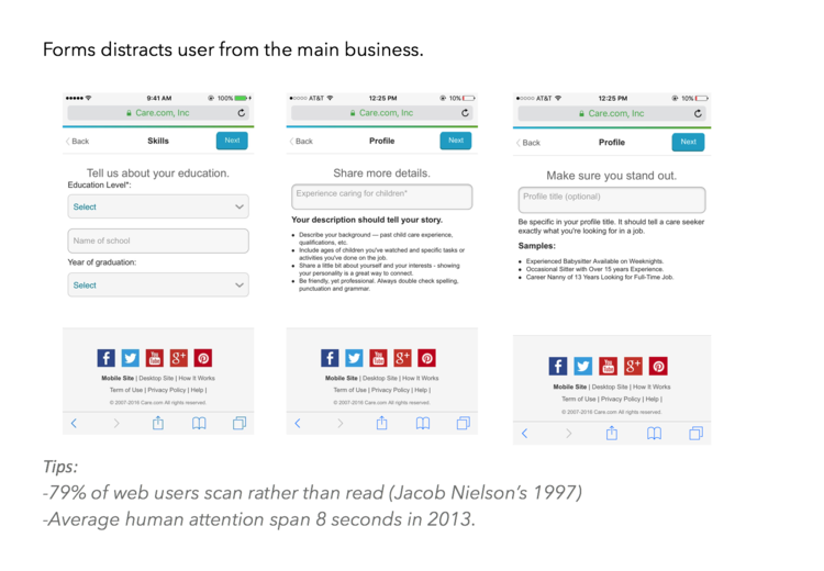
Instruction descriptions are too long.
Takeaways:
Two critical design flaws that block providers’ engagement:
Lack of instructions for the action items, users don’t know what they should do (how to respond, update profile, etc.)
Lack of status visibility. There is no benchmark for providers to know whether their performance is good or bad.
Solution Ideas:
Providing the guidance to become a more engaging provider.
Enhancing the review system.
Success metrics:
Increase response rate, profile completeness, market engagement, and ratings. Incentivize providers with a power status.
Solution - Guided provider
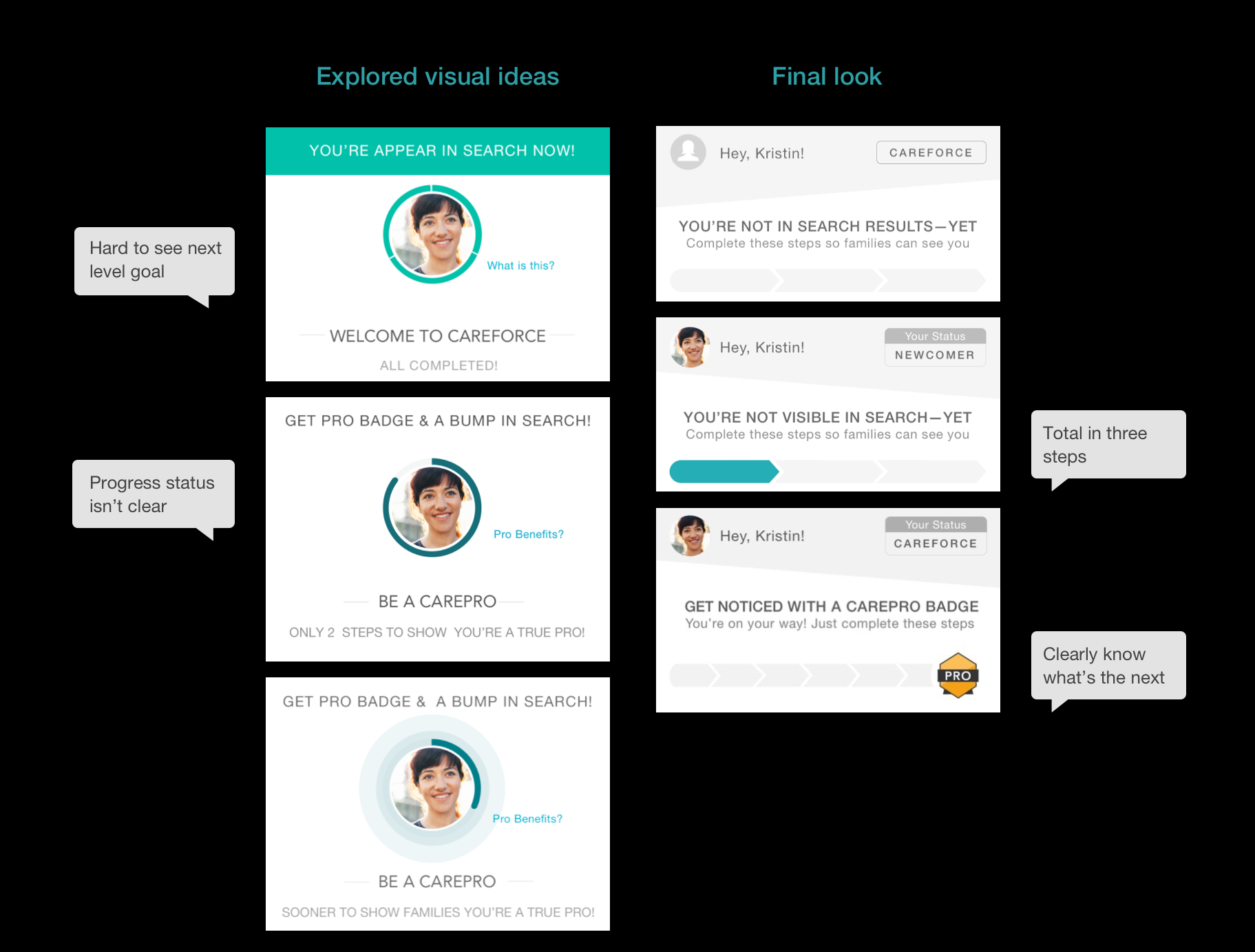
I came up with a gamification solution with a 3-level tiering to motivate and guide a provider. Both the seeker and the provider can see the provider’s badge status. I collaborated with the PM on the initial concept and then iterated the wireframe to fulfill the user needs we observed from the research.

1. Set a goal for provider - Three 3-level tiering

2. Clear Guidance on the action items - To-do list increased the product discoverability
Provider tasks were buried too deep and spread out on different pages, I designed a customized to-do list on the landing page to help providers manage and track their progress. Only displaying the most relevant information by user's status.

Homepage- After
3. Care Pro Design
Designed a series of visual indicators for the three-level tiering.

4. Response time track
Took advantage of users’ common sense on dial meters. showing response time in a progress bar, star ratings, and designed different indicator statuses.

5. Showing provider’s progress


Impact

Since launch, the volume of seeker complaints regarding provider quality decreased by 37%. Significant increase in the volume of CareForce level providers on the platform. CarePro tier, although small, has seen a 43% increase since June.
Future Design Improvements:
Room to optimize email verification process for upgrade from New Comer to CareForce
No instant gratification as providers complete criteria - loss of provider engagement.
Applying User-centered design to more Projects
In the next project, I worked on the second hypothesis of the review system and continuously improved the provider quality. I established the user-centered design methodology within the design team and applied it to later projects, e.g., pet care app, care@ work.


